
Fields are the core element of any table. Once you’ve finished with the Main settings of the new Library, it’s time to add some fields.
To create a new field, switch to Fields tab, click  button and choose the needed field type. Depending on the type, fields have different properties and dependencies and used for various types of data. We advise you to learn more about types in the relevant article before you go.
Common Field Parameters
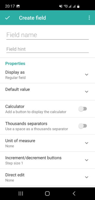
Every field has a Name, which is required. Additionally, you can configure several other parameters depending on the chosen field type. Here are some common parameters found in most fields:
- Hint: Sets a prompt text that will be shown to library end-users to help them fill in the data properly.
- Default Value: Defines the data that will be added to this field once an entry is created.
- Required: Specifies whether the field must be filled out or not.
- Direct Edit: Adds the ability to change the field value directly from the entry view card, so you don’t need to open a separate screen to edit the entry.
- Data Validation: Enforces rules on what data can be entered in the field to ensure data integrity.
- Font: Allows you to set the font style and size for text fields.
- Field Description: Provides a description of the field to give end-users more context about the data they need to enter.
Display As Options
The Display As section defines how a field will be shown in the list of entries. You can configure specific fields to serve as:
- Name: The main identifier for the entry.
- Description: Additional information or details about the entry.
- Status: The current state or condition of the entry.
- Thumbnail: A visual representation, such as an image, for the entry.
Alternatively, you can leave the field as regular, meaning it will only be viewable after opening the entry card.
Note: Displaying fewer fields in the list of entries can improve the load time of your library.
Specific Field Parameters
Other parameters depend on the specific field type. Here are a few examples:
- Integer and Real Fields: May include a calculator button or units of measure.
- Image Fields: You can define the picture orientation (vertical or horizontal).
- Boolean (Checkbox) Fields: You can adjust whether the user can edit it after opening the entry card or just by viewing the list of library entries.
- Single Choice List or Multi Choice List: These field types have settings to specify a list of predefined items for selection.
- Calculation Field Type: This field type includes settings for specifying a formula expression for automatic calculations based on other field values.
Dependencies
Dependencies allow you to define whether a field is visible or not, depending on the value added to other fields. Dependencies can also specify the content available for selection in choice fields based on the value of another field. To create a dependency, there should be at least one conditional field like Boolean (Checkbox) or Choice-based field.